
The New York Fed report on Home Prices, Housing Wealth and Home Equity Extraction provides an interesting look at home prices and home ownership rates before and after the recovery.
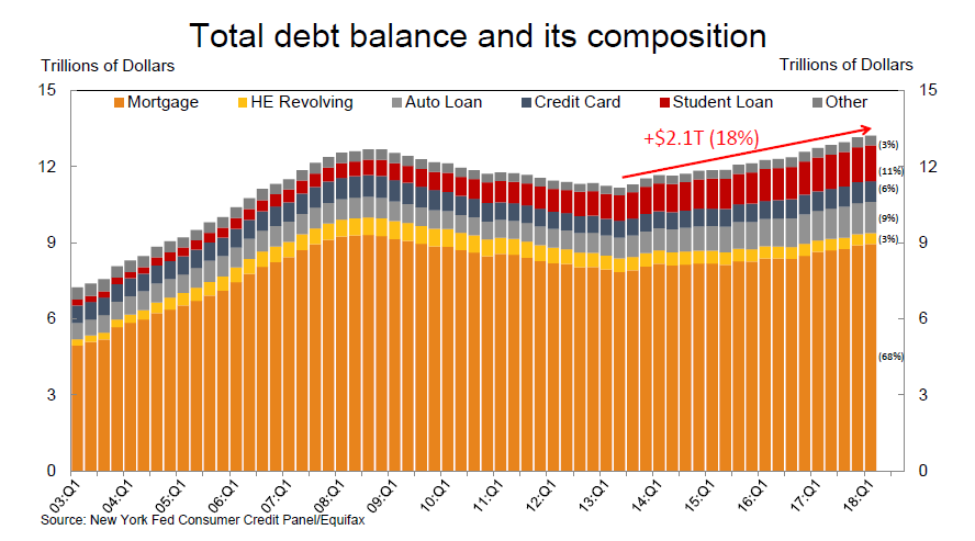
Mortgage Debt

Home Prices

Ownership Rate

Home Ownership Rates by Age

Housing Wealth

Median Borrower Equity 2006

Median Borrower Equity 2011

Bedian Borrower Equity 2017

Wealth Shift

Cash Out Refis Pick Up

Borrowers Older

Leveraging Wealth or Struggling to Pay Bills?
- 2006 originators were primarily levering up, with a small decline in average credit card balances, and piggybacks a large share
- 2017 originators’ credit reports show evidence of credit card and student loan consolidation
NY Fed Wrap-UP
- Home prices have recovered, but homeownership has not, especially for younger Americans, compounded by tight underwriting
- Housing wealth has shifted toward older, more creditworthy borrowers
- Equity extraction is relatively low now, considering potential uses to borrowers and high levels of tappable equity
Mish Wrap-Up
- Congratulations, Fed, you blew another bubble in which new borrowers cannot afford homes.
- Cash-out refis have accelerated recently.
- The NAR constantly moans about lack of supply of homes. As boomers die off, supply will increase.
Related Articles
- Housing ATM is Back (But it won’t work any better this time)
- Mortgage Rates Highest Since 2013 Taper Tantrum: “It’s Not a Drill, It’s Panic”
- Fed Tightening Cycles Coincide With Bursting of Asset Bubbles: How to Play It
Mike “Mish” Shedlock
Very interesting data, but given that mortgage debt is still below 2008, and that the growth of debt is only in two areas, vehicles and student loans, I don’t see any evidence that the Fed’s artificially low rates drove borrowing to extreme levels. Owner’s equity seems to have recovered back to the 2006 levels in many/most parts of the country, particularly the flyover states.
OK, some questions about the Corelogic home prices chart – does this factor in inflation? Does it account for productivity growth? Does it take into account changes in the average sq ft of houses? When I run my models I see a bubble peaking in 2006, but prices at normal rates at the moment when inflation and productivity are factored in.
Aware of the editing issues – Changes Coming
Very Nice – Thanks
Here is the animated GIF of all three images. Mish, I’m not sure what you’re going for with showing 2011, so I set the timing slower and hoped it would be OK.
Cmd: convert -delay 100 -dispose None median_2006.jpg -geometry 706×414! -delay 75 -page +8+9 median_2011.jpg -page +3+9 -delay 200 median_2017.jpg output.gif
link to s3-us-west-2.amazonaws.com
Note: I had to post this comment, then click on the “…” thingee, choose “Edit”, then use the edit logic’s “Upload Photo” to get the image uploaded. Normal photo upload didn’t seem to work. Animated GIF problem?
Too, the “Edit” logic presents a “Post” button. Rather better than assuming a CR means “post”.
I like that – can you add 2011 in the middle?
Anyway, it appears the boomers are spread from the Pac NW down through the Rockies washing around Illinois and stopping for Florida and the DC-Boston megopolis. Those stopping/wash-around areas are the big losers. Do East Coasters retire now to other countries instead of Florida? Or to Texas and Rockies? I’m guessing they’re not moving to the South or MidWest.
Hmmm. Well, apparently TheMaven doesn’t like animated .gif images. … Second try. Looks like you gotta click on the URL to pop up the image.
Created with this command: convert -delay 50 -dispose None median_2006.jpg -geometry 706×414! -page +3+9 median_2017.jpg output
.gif
link to s3-us-west-2.amazonaws.com
Here’s a quick take on the map from 2006 to 2017:
It makes sense. Older homeowners – many being retirees – now earning 0.1% on their so-called “Money Market Accounts” are tapping the equity in their homes through cash out re-fis to pay their monthly
bills. Millenials get screwed twice. Homes are unaffordable for them and they will not even inherit their parents’ home. The bank (mortgage holder) will get it.