
Reader “Zavo” just posted this on my site.
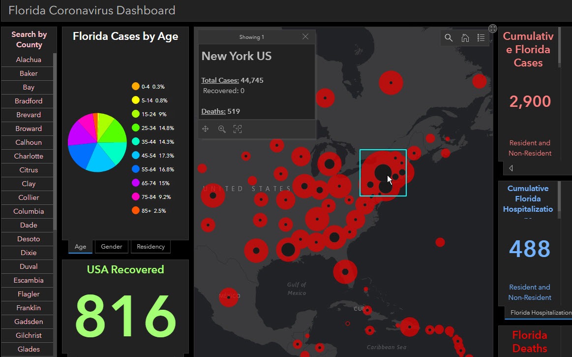
Mish, I was inspired by your COVID tracking data site you found and your projection graphs you posted to add similar projections to our interactive map at work. This map (dashboard) contains details on the coronavirus in Florida, USA, and the world. We added lots of nice data graphs to consume, including hospitalizations. Zoom out on the map to see spatial data for the states and other countries. The COVID tracking data site was a great find. Thanks.
Coronavirus Dashboard
Thanks to Zavo for an excellent site.
Please check out the Coronavirus Dashboard.
The site says “Florida Coronavirus Dashboard“, but it is not just Florida. My snip shows New York.
International

Use the wheel on your mouse or the +- keys to zoom in and on the central portion of the site to zoom not just nationally, but internationally.
Here is one of my posts that seems to have inspired Zavo: Coronavirus Trend: One in 10 of Those Hospitalized Die
Here is my original post: Covid Tracking Project: How Long to 1 Million US Cases?
I don’t deserve much credit (but I am pleased to have helped in a small way).
Hats off to Zavo and everyone else involved if it is a team effort.
Also thanks to the Covid Tracking Project for the data.
Mike “Mish” Shedlock
You might also link this fever map from Kinsa Health. link to healthweather.us
Supplimental for the number crunchers out there.
link to youtube.com
The link says 100,000 US tests a day. With 17,000 +ve. 17% !!! He suggests >5% is needed but the countries that have it under control are getting >1%. So US needs to be testing 1.7m at the moment and doing heavy isolation measures to get it under control. Obviously it is doing neither so 1m isn’t far away.
I’ve been using the Florida DOH ‘dashboard’. While I know the number of confirmed cases and the approximate population of my county what I don’t know is the number of tests ( at bats?) to get a real feel for the ‘batting average’ of the population. I use Worldometer’s state by state breakdown and its daily increase to get a better handle on the problem. It looks bad by any measure as the number of cases keeps on keeping on in relentless fashion.
Our Dashboard has total test count per county. Just click on the county and a ‘pop-up’ window will display several stats. The reason we created our Dashboard was we were not satisfied with the Florida DOH version. The color ramp, lack of detailed data, etc.
Here is the link:
Florida’s huge ‘Republican-rich’ retirement settlement hit with coronavirus community spread:
For numbers geeks, the NYTimes is trying to track all cases by county at:
They publish their data in .csv form on GitHub:
As of this moment, GitHub says the data is “initial public release” as of 17 hours ago.
Is a US Census .csv file with county population data, which you’d want to calculate
death_count / population = death_count_per_personor some such.We will check this out. The more data options the better. Thanks.
…and yes, per capita figures are always what I prefer.
Tracking is nice, but limits the understanding of risk. All data-sets needs the following…
Listing of co-morbidity for all hospital cases – Heart Disease, High blood pressure, diabetes, COPD, etc.
Poor and combine stats are being used to spike fear like: “48% of death in NYC are under 72” – WTF does that mean????
We need to admit C19 discriminates, not by race or gender, but by AGE and CO-morbidity. In WA as I type 93% of cases are 60+, 99% 50+, no one under 39 has died, also Bloomberg had posted age data and co-morbidity in Italy, 98.5% cases had a 2nd issue at the average age of death is 79.5. And a small study out of NYC show 95% had a co-morbidity
IT – link to bloomberg.com
NYC – link to bloomberg.com
What is overwhelming hospitals are NOT spring-breakers, but 60+year olds that won’t stay inside or avoid contact. I am in my mid-40 with kids, we are staying in, taking precautions, but not going crazy. When I leave my house to shop, I see waaaay to many 60+ yr olds out-and-about. I’ve told my father, mid 60’s with COPD to BUG IN… he is leaving his house nearly daily, crazy.
Yes, I agree. We would love to have access to deaths by age breakdown and if any preexisting conditions were present. Meaningful information.
Our data is based on the testing – which is currently on people showing major symptoms.
35% of the population is 50+ – that’s 100 million people
Italy’s cases and death rates are still rising – don’t know how a definitive statement can be made at this point.
Co-morbidity can include obesity / diabetes/ smoking etc – common in people of any age.
Like HIV – a person can’t knowingly infect another person – If you’re a 30 yr old with Covid_19 you can’t demand that a vulnerable portion of the population stay home so you can go out.
Spring breakers may still be in the incubation phase – symptoms may not show for 2 weeks. Young with or without symptoms are still spreading the virus – to friends and family with pre-existing conditions.
If this was just a seasonal flu hospitals wouldn’t be overwhelmed. This is a pandemic – even declared by WHO.
And if Chloroquine is the cure – why doesn’t it work on a typical flu?
Chloroquine has proven effective against a wide variety of bacteria and viruses, but not all. Also, some that it used to successfully treat are now immune to it. It will not be surprising if it proves effective, nor will it be surprising if it doesn’t prove effective.
As far as the Spring breakers, anyone that contracts it, and then spreads it is a part of the problem. They may not be the ones that die, but they they will potentially infect 3.8 other people who might, and those people will infect still others. Worse, the Spring breakers, by increasing the spread, make mandatory shutdowns more likely, and lengthen the time the economy must be crippled. The only way we can get the economy going again is if we stop the spread, so anyone that increases the spread helps to crush the economy.
200,000 early next week ?
Mish, glad you like the map & stats. Yes, it was a team effort. Kudos to our GIS Analyst for creating the ‘Dashboard’ and thanks to the Florida Department of Health, Johns Hopkins, and the COVID Tracking Project for compiling the data. Our aim is to maintain this service as long as necessary. We will continue to expand the type information as time permits. Godspeed to all.
Nice work!
Zavo – Please give me a call – I sent you a private message on the Maven. If you cannot find it, shoot me an email.
MikeShedlock @ Gmail.com
Mish, will email you tomorrow. I will reference Zavo in subject line. Been a long day and plus… it is my birthday! Cheers!
Best,
Zavo
100,000 cases by arcgis Johns Hopkins!!!!!!
We’re #1!
“It’s a hoax!!!”
and by my calendar it’s Mar 27 not Mar 26!!@mish was just spreading hype with: if the trend holds, 100K by the 26th… preposterous!!!
YES! I am all set with the closing company this coming April 3 to close and get rid of my condo in FL! And I will finally be totally out of , virus or not, the Fd up state of Florida!
Hi@Mish this story reminded me an on old saying of yours. A variant of it might go something like: those who can’t be hospitalized, won’t be hospitalized.