
Here we go again with a broken record of unbelievable reports and suspect data.
Hooray! We finally have the benchmark adjustments for every month in 2025.
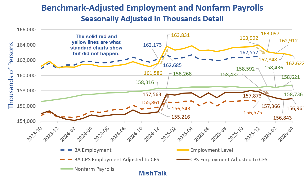
Understanding the Lead Chart
Every January (typically), the BLS has annual revisions to nonfarm payrolls and household population employment. The BLS does not back revise the household charts.
Because the BLS does not back revise, we see ridiculous numbers such as employment rising by over 2 million in a month (first yellow arrow).
To correct for the population adjustments, the BLS provides an adjustment series to normalize employment levels to match nonfarm payrolls. The BLS calls this “experimental” data but the regular posted data is known silliness.
The experimental series is LNS16000000, “Employment Adjusted to CES Concepts“.
For 2024, the BLS admits that it undercounted employment by 2 million. Instead of parsing that out in the correct months, the BLS plowed the entire adjustment into January of 2025.
For 2025, the BLS admits that it overcounted employment by 1.4 million. Instead of parsing that out in the correct months, the BLS plowed the entire adjustment into January of 2026.
We did not suddenly add 2.245 million jobs in January of 2025, all US-Born. (Difference between the dashed blue line and the yellow line).
Moreover, there is no valid historical data on full vs parttime employment, on foreign born employment, and many other BLS data series. And there won’t be. There are no back adjustments key data components.
All posts on foreign-born employment, parttime employment, etc., suffer this flaw. All year-over-year (or December-to January) analysis you find on these stats is permanently flawed.
2025 Experimental Data
In April, the BLS has finally released Experimental series accounting for January 2026 population control effects.
The comparability of Current Population Survey (CPS) labor force measures over time is affected by the annual introduction of updated population estimates from the U.S. Census Bureau.
The January 2026 population control adjustment resulted in a decrease of 231,000 people (or 0.1 percent) in the estimated size of the civilian noninstitutional population age 16 and older.
However, the adjustment increased the number of people not in the labor force by 1.2 million. The total civilian labor force decreased by 1.4 million (which resulted from a decline of 1.4 million employed people).
(Official CPS estimates for December 2025 and earlier months have not been revised, in accordance with usual practice.)
Experimental Series
In 2025, BLS produced new experimental time series measures to account for the size and timing of the large population changes reflected in the January 2025 population control adjustment. For the January 2026 adjustment, BLS continued the production of these series with modifications to the methodology to reflect the changes in demographic composition observed in the January 2026 adjustment. These updated experimental series replace the previous series.
The experimental series use the monthly time series (back to April 2020) available from the Census Bureau’s Vintage 2025 population estimates that form the basis of the January 2026 CPS population control adjustment.
The experimental series are smoother over time, as they do not show the annual effects of the population control adjustments that occur each January in the official series. By applying the compositional factor uniformly over time, the experimental series show lower labor force participation (and employment) relative to the official series.
These series provide historical context that is roughly consistent with estimates for 2026 that reflect this year’s population control adjustment. The experimental series adjusts data back to April 2020, the decennial census reference point.
Standard vs More Accurate Experimental Data
Between December 2024 and January 2025, the standard data shows an increase of 2,245,000. The adjusted data shows a gain of 692,000.
For December 2025, the employment level is a reported 163,992,000 vs the adjusted data at 162,557,000.
By December 2025, the standard data employment level was overstated by 1,365,000. That did not happen in a single month. It was the result of cumulative months of bad data every month for a full year.
All standard year-over-year household data comparisons are nonsense. Comparisons between January and December of the prior year are also invalid.
My Charts
I will continue to use what the BLS refers to as “experimental data” because the official series household data is admitted nonsense.
Here are the latest, and undoubtedly wrong monthly job report details.
Monthly Job Report Details
- Nonfarm Payroll: +115,000 to 158,736,000 – Establishment Survey
- Civilian Non-institutional Population: +97,000 to 274,995,000
- Civilian Labor Force: -92,000 to 169,995,000 – Household Survey
- Participation Rate: -0.1 to 61.8% – Household Survey
- Employment:-226,000 to 162,622,000 – Household Survey (-64,000 in March)
- Unemployment: +134,000 to 7,373,000 – Household Survey
- Baseline Unemployment Rate: +0.0 to 4.3% – Household Survey
- Not in Labor Force: +188,000 to 104,959,000 – Household Survey
- U-6 unemployment: +0.2 to 8.2% – Household Survey
Nonfarm Payrolls Change by Sector

Nonfarm Payrolls Change by Sector in Thousands
- Nonfarm Payrolls: +115
- Manufacturing: -2
- Construction: +9
- Leisure and Hospitality:+14
- Private Education and Health Care: +46
- Professional and Business Services: +7
- Information: -13
- Financial: -11
- Retail: +22
- Wholesale: +6
- Government: -8
Monthly Revisions
- The change in total nonfarm payroll employment for February was revised down by 23,000, from -133,000 to -156,000.
- The change for March was revised up by 7,000, from +178,000 to +185,000.
- With these revisions, employment in February and March combined is 16,000 lower than previously reported.
Part-Time Jobs
- Involuntary Part-Time Work: +445,000 to 4,942,000
- Voluntary Part-Time Work: -61,000 to 22,706,000
- Total Full-Time Work: -424,000 to 134,252,000
- Total Part-Time Work: +123,000 to 28,413,000
- Multiple Job Holders: +77,000 to 8,434,000
The above numbers never total correctly due to the way the BLS makes seasonal adjustments. I list them as reported.
These numbers are highly unreliable for reasons noted above. Year-over-year comparisons are invalid, period.
Hours and Wages
- Average weekly hours of all private employees fell by 0.1 at 34.2 hours.
- Average weekly hours of all private service-providing employees fell by 0.1 hours to at 33.1 hours.
- Average weekly hours of manufacturers fell by 0.1 hours to 40.0 hours.
A tenth of an hour does not sound like much. But multiplied across 158 million, that’s a lot of hours.
Of course, this data is only as good as the data collection.
Hourly Earnings
This data is also frequently revised. Here are the numbers as reported this month.
Average Hourly Earnings of All Nonfarm Workers rose $0.06 to $37.41. A year ago the average wage was $36.12. That’s a gain of 3.6%.
Average hourly earnings of Production and Nonsupervisory Workers rose $0.11 to $32.23 A year ago the average wage was $31.09. That’s a gain of 3.7%.
Those gains are reportedly beating inflation. But that’s nonsense too because the CPI does not count property taxes or homeowners’ insurance in its calculations.
Unemployment Rate

Alternative Measures of Unemployment

Table A-15 is where one can find a better approximation of what the unemployment rate really is.
- The official unemployment rate is 4.3 percent.
- U-6 is much higher at 8.2 percent.
Both numbers would be way higher still, were it not for millions dropping out of the labor force over the past few years.
Some of those dropping out of the labor force retired because they wanted to retire. Some dropped out over Covid fears and never returned. Still others took advantage of a strong stock market and retired early.
The rest is disability fraud, forced retirement (need for Social Security income), and discouraged workers.
The entire series is flawed by non-applied annual benchmark revisions.
The series is also flawed by poor response rates, deportations, illegals not answering phones, sampling errors and non-sampling errors.
Birth Death Model
Starting January 2014, I dropped the Birth/Death Model charts from this report.
The birth-death model pertains to the birth and death of corporations not individuals except by implication.
For those who follow the numbers, I retain this caution: Do not subtract the reported Birth-Death number from the reported headline number. That approach is statistically invalid.
Birth-Death Methodology Explained
I gave a detailed explanation of the model and why the usual calculation is wrong in my June 8, 2024 post How Much Did the BLS Birth-Death Adjustment Pad the May Jobs Report?
I repeat, do not subtract the birth-death number from the headline number.
Household Survey vs. Payroll Survey
- The payroll survey (sometimes called the establishment survey) is the headline jobs number. It is based on employer reporting.
- The household survey is a phone survey conducted by the BLS. It measures employment, unemployment and other factors.
If you work one hour, you are employed. If you don’t have a job and fail to look for one, you are not considered unemployed, rather, you drop out of the labor force.
Foreign-Born Employment
The numbers in my charts are seasonally adjusted. Foreign born employment is not adjusted, compounding comparison errors.
And we have no BLS revised data for foreign born employment. So, all such foreign and US-born comparisons with BLS data remain nonsense.
A second major problem with foreign-born employment is the BLS makes no distinction between US citizens who were foreign born and genuine foreign workers.
More Huge Negative Revisions Are Coming
Q: How do we know that?
A: Highly accurate but lagging QCEW and Business Employment Dynamics (BED) data show what’s coming.

For details, please see my May 4 post Net Job Creation by New Businesses Is Negative Once Again
More jobs are lost in closing businesses than gained in new businesses.
The Business Employment Dynamics (BED) data shows a net loss of 159,000 jobs for 2025 Q3 and a net loss of 321,000 jobs for 2025 Q2.
Negative numbers are not the norm outside of recessions.
The BED and QCEW reports are very accurate but lagging. This is why we know more negative revisions are coming.

Also note Manufacturing Is the Biggest Net Loser in Jobs, 5 Quarters Total
Here’s a breakdown of BLS Business Employment Dynamics (BED) by sector.
For more manufacturing charts click on the above link.
Final Thoughts
Despite the headline beat the street 115,000 jobs, this was not a great report.
Employment fell by 226,000 and involuntary parttime employment rose by 445,000.
Of course, this assumes you believe any details in the report, which I don’t. There is no reason to believe any of these details this month or any month.
Related Posts
February 11, 2026: BLS Revises Nonfarm Payrolls for 2025 Lower by 1 Million Jobs
For the second year, the BLS annual benchmark revision was hugely negative.
February 11, 2026: Another Look at the Incredible January 2026 Jobs Report
Do you believe the nonfarm payroll report for January 2026?


Do you think tax withholding from the DTS a good proxy for employment?
Here is the WSJ version of the employment report:
U.S. Adds 115,000 Jobs in April With Solid Hiring Across Sectors
Would you expect any Newscorp propaganda entity to tell the truth?
“this data is only as good as the data collection”
THESE data ARE only
The BLS sampling error means that the establishment figure is +/- 122K. 115K is not distinguishable from 0.
I’m a sometimes regular poster but I haven’t posted in the last week because I was relocating and traveling in the last week.
I lived in Massachusetts in a town on the border of Connecticut. I was basically in the Hartford metropolitan area.
The economy there sucks. The nearest city (Springfield, Mass.) has an unemployment rate of 7.5%, up from 7% last month and up from 6.6% last year. There are NO major employers in that city except for local stuff like hospitals, schools, stores, restaurants, etc.
They shed all the good jobs away since the 1970s and the whole area is like something out of Mad Max. Trash everywhere, public spaces and infrastructure deteriorating, highly segregated based on income, etc. It’s what a lot of America has turned into. A post-apocalytpic rust belt hellscape.
The kicker? Outrageous rents and housing prices. Not enough housing to go around. Very crowded.
I’m happy to report I relocated to a lower cost of living state that is actually growing (slightly) and doing well economically, relatively speaking. Unemployment rate is 3.5%-4% where I am now.
Where? I’m actually not going to say. Partly because I want to retain some anonymity and partly because it’s apparently a well kept secret as a place to seek refuge in.
Nobody really wants to move here despite it being a great place to live that’s also cheap. Not the greatest weather and a bit boring, but I’ll take it. I can make my own fun. (I had the same idea as MPO but I’m choosing to stay in the U.S. I do plan to vacation in Costa Rica, which is where I had fantasies of retiring in.)
Congrats on your move. Sounds like you executed an exit strategy. I don’t blame you for not telling where you are going. I won’t be telling either because I don’t want hordes of people following me there.
Just keep in mind that what you experienced in Mass will eventually happen everywhere in US. It’s part and parcel to the whole demographic death spiral that people don’t quite understand but are starting to wake up to it like you just did.
I hope you’re renting for a year before you make a purchase decision. It usually takes that long to make sure you really like it after going through all seasons and political calendar activities.
I won’t keep it a secret. I moved to Iowa. Currently in Des Moines. I lived in Omaha for 14+ years as a young adult. I thought Omaha was a great all-American place to live. Cheap but good. I had no idea how good it was until I moved back East where I am from originally. Glad to be back in the midwest. Des Moines is similar to Omaha but a smaller scale.
Des Moines is paradise to me. Very clean and tidy. Hardly any trash in public spaces (very common in New England surprisingly). Very friendly laid back people (a stark contrast to miserable Mass-holes: they really are that way). Traffic is non-existent. Stores aren’t crowded. Hardly anyone in Aldi everytime I go. Loving the positive change.
Des Moines/Omaha/Sioux Falls are solid places. All are growing.Tradeoff is extreme climate and “boring” landscape. This area of the country will be the last to fall into Mad Max decline. I recommend anyone trying to “escape” to move here if they can. You can live like a king if you have above average income.
https://censusreporter.org/profiles/16000US1921000-des-moines-ia/
Demographic death spiral confirmed. Enjoy it though while it lasts…
Des Moines (the city) is not growing as it is a fixed size and has older housing stock. The metro itself is growing and has been since the 1990s. Ankeny and Waukee are fast growing suburbs with all new housing and stores.
Quality over quantity? I like how you think regarding living in a great place that does not grab headlines. Living in the upper midwest has significant advantages from a cultural and safety point of view. Even the police in my area are civil and nice to people.
As for the winter? I love having four distinct seasons!
Wolverines’ American consumer citizen sentiment (it sucks) … a good bell weather of future US and global economic activity … (coming next week …)
So the Fed doesn’t really know what happened in the past, because of bad data. And even if they did know what happened in the past, they still don’t know what will happen in the future.
So we have a powerful group of people who don’t know anything, but they get to steer the economy anyway. And in spite of all that, most people think that they are better than a simple free market system?
We really must be living in a simulation, and it’s scripted about like a sketch on Saturday Night Live.
Looks like a great opportunity to fire several hundred useless government economists* and plug-in some AI
+++++++++
* All economists are useless
As has been reported, economists exist to make astrologers look respectable.
I live in an agricultural area and things are chugging along fairly normally. There is concern about the low snowpack in the mountains and the school districts keep whining about their spendthrift levies getting rejected, but that’s about it.
No different than Company X beating expectations…not the expectations as laid out on day 1 of the quarter but the most recent expectations which had been continually revised down throughout the quarter. When the game is gambling, lots of folks in on the game and there’s money to be made you can bet it’ll be a cocked hat.
Normally this kind of report might send bond yields higher, but for now bond traders seem to be believing Trump’s crap about being close to a deal with Iran.
What harbingers of peace will we witness this weekend, I wonder?
A hard-hearted harbinger of haggis
The interesting stat that came out today was the labor participation rate dropped to 61.8% which begs a question, if the boomers are retiring, young people aren’t having kids for decades now, ICE is scaring illegal workers away, H1B visas now cost $100k+ and labor participation is down, where the heck are all the jobs coming from?
https://fred.stlouisfed.org/series/CIVPART/
None of the stats make any sense. And if the economy were booming with a ton of jobs, shouldn’t inflation be rising a whole lot faster? Shouldn’t wages rise with labor participation rate down?
Again, makes no sense. And don’t get me started on farmers going broke, manufacturing jobs disappearing and all the other stuff Mish has posted the past couple of months.
Employment fell by 226,000 and involuntary parttime employment rose by 445,000.
Of course, this assumes you believe any details in the report, which I don’t. There is no reason to believe any of these details this month or any month.
Newly added lines this month.
Of course, this assumes you believe any details in the report, which I don’t. There is no reason to believe any of these details this month or any month.
I intend to use those indefinitely.
New this month. The BLS added participation rate and unemployment rate to the experimental series. Royally screwed up my charts when I pasted the data. Took me a while to figure out. I will take a look at the experimental series on this now that you mention it. – The link you posted is known garbage. If it’s not in the experimental series, it’s nonsense. Top of the list is foreign born.
Try using AI to sort it out. It’s a coin toss but it may make the work easier.
Will it give you the truth, or what you want to be the truth? Can you tell the difference?
We have reached a point where the only truth I trust is the options market. Options traders have a vested interest in earning profits so they will scour the world for data and place bets accordingly.
It’s been mostly right for a long time now. We’ll see if the junk bond market melts down this month or next as the options predict. Of course, government intervention can always kick the can down the road.
Nothing like manipulated information to keep the bull run going.